Information Architecture
The first step in this phase is to make cards for Card Sorting for user research. I went through each page of the site and made notes of items on the website. These cards will be used to find out how users categorize the items naturally to understand how to organize the information architecture. I also keep notes of duplicated content or content that isn't organized properly.
I also found similar websites of research labs at other universities to see how they are organizing their work and their design. I found four other labs and made notes on what I liked and didn’t like.
Card Sorting
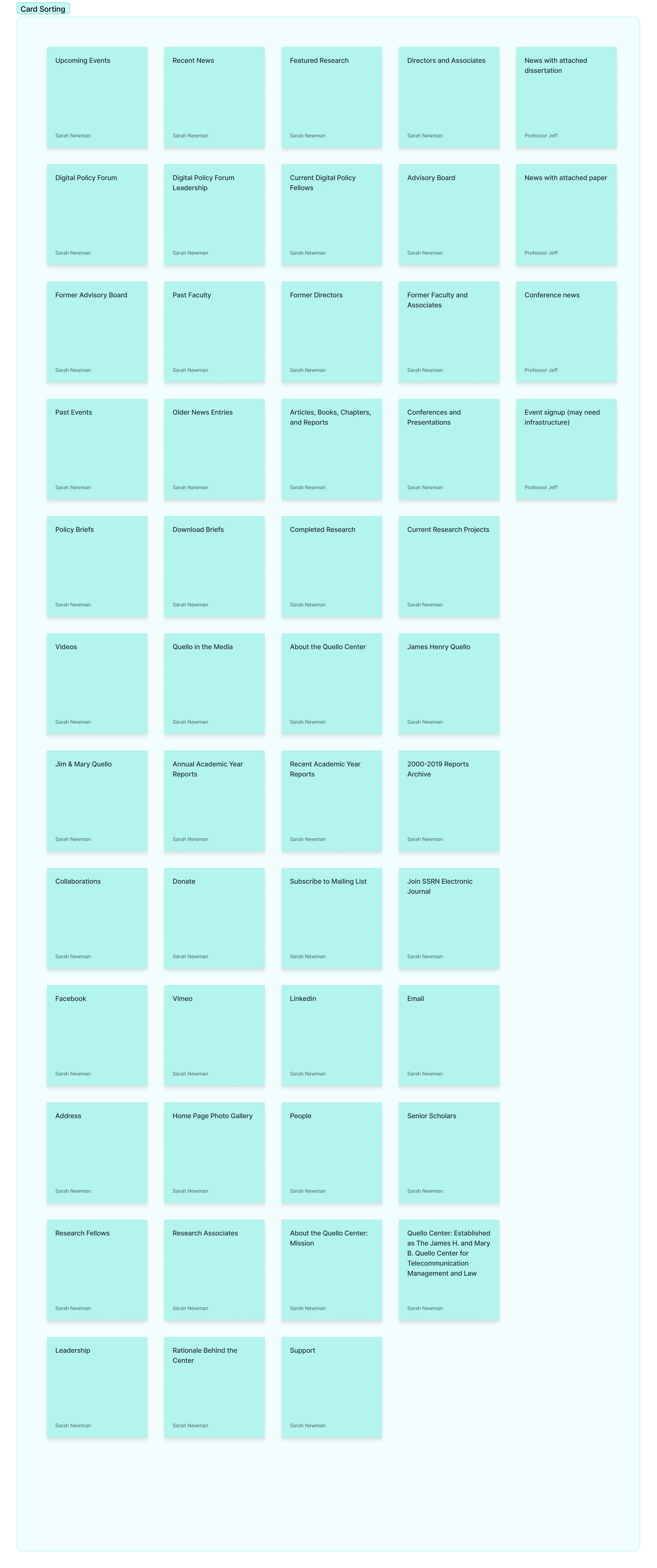
Below are digital sticky notes of each item that will be used in the card sort.
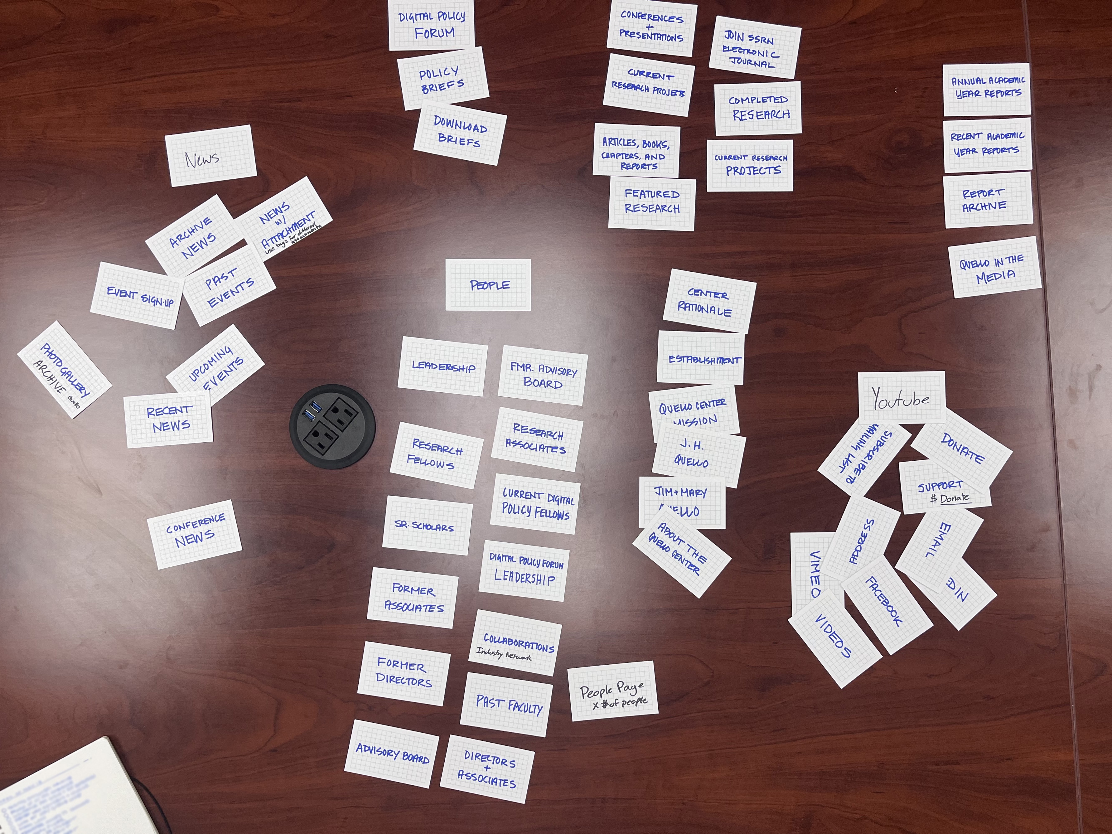
These items were then written on physical note cards to be able to run the research in person more easily with multiple people. The card sort ran with my mentor (who is the head of the project), the client, and me. We were able to work together to split the cards into sections. The data we gathered allowed us to determine the categories that will be in the navigation bar. The card sort piles are shown below.
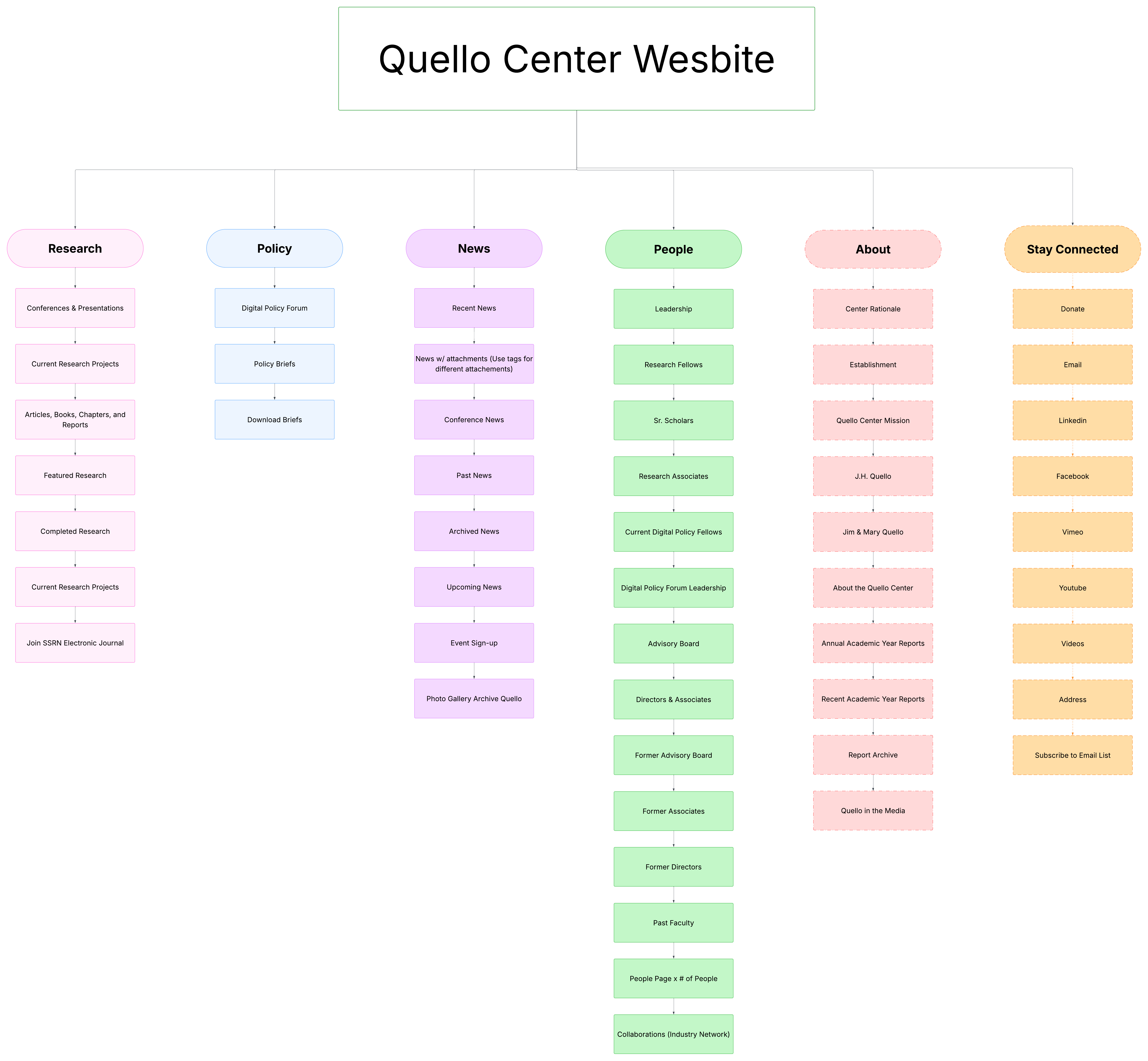
We also further discussed who our user archetypes are. The main users are the research community, policy makers, and the general public/media. Knowing this allowed us to determine the order of the navigation bar. I was able to make this information architecture diagram with the data gathered from the card sort.